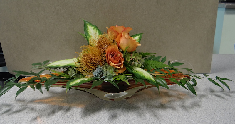
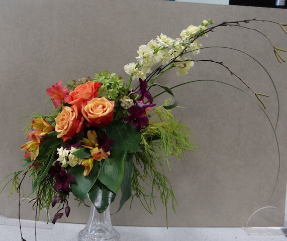
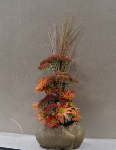
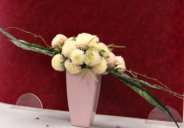
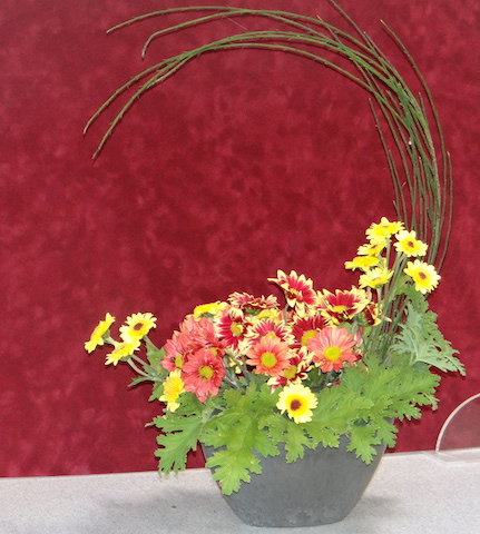
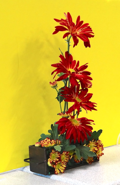
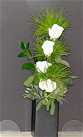
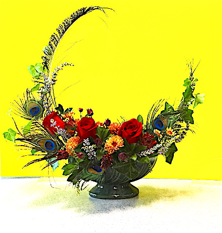
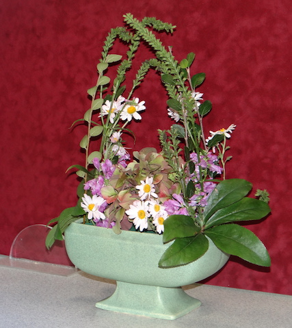
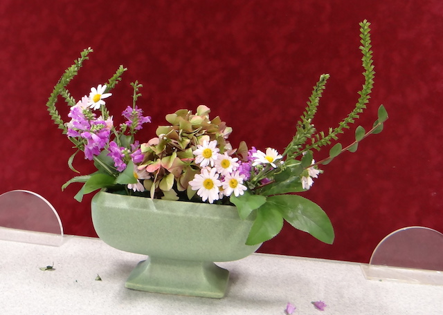
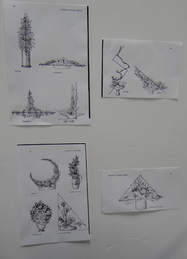
In October, Marilyn Potter offered another of her excellent classes in floral design at the Mt. Airy Senior Center. The theme for this session was Line in Design. Participants learned about Line, Asymmetrical, Mass, Crescent or Hogarth designs and could choose any of these designs to work on for the class.
 Afterwards, there would be critical assessments of the merits of each participants efforts with pointers on how to improve the design if warranted. Marilyn’s experience as a judge allowed her to step in and add or subtract components after asking the group to give opinions on the piece. We also experimented with different colors of backer board to see what the effect on the design was for viewing purposes.
Marilyn sends out information about the classes each time with a brief description of the design, floral supply lists, instruction for preparing the material and instructions for tools likely needed. See this information after the photos below.
*****
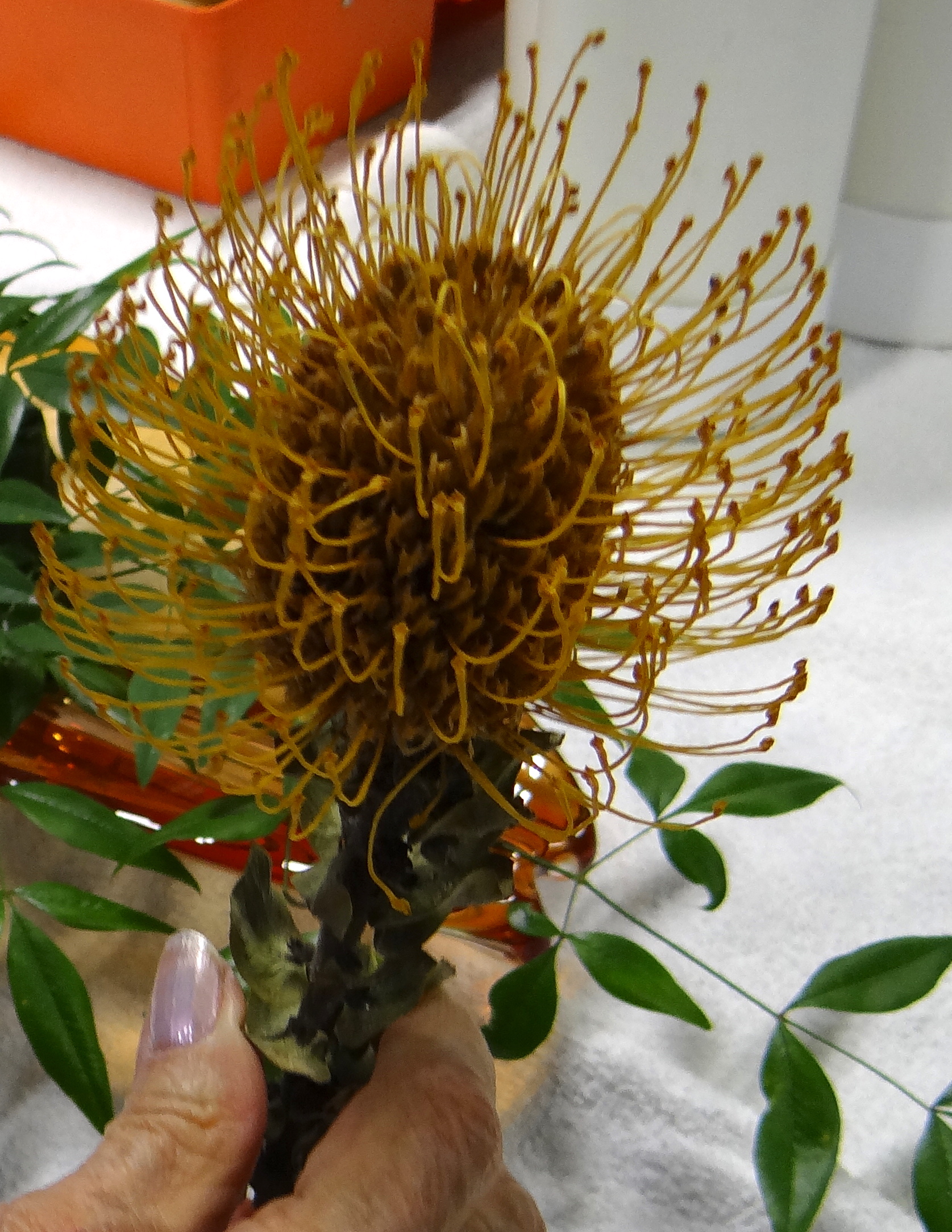
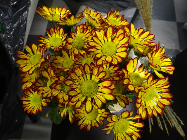
People brought some interesting items to use including these neat spoon shaped mums and this protea flower.
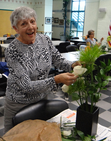
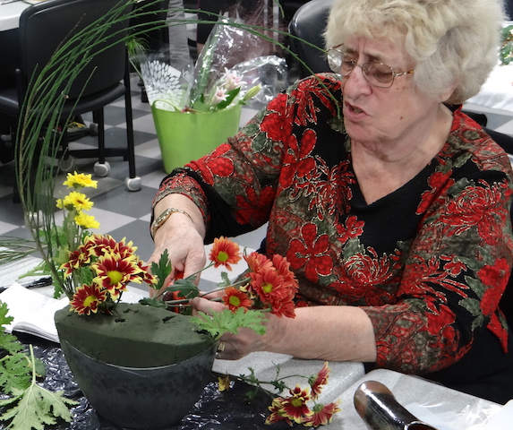
This was Karen’s first time at Design Class,doing this sort of line design. She seemed to be enjoying it! I pestered Marjorie as she was thinking her way through her design, talking to me while cutting a mum.
Here are the finished pieces up for review by the group: (Click to enlarge for slide show. X on top left to exit slideshow)
Here’s an example of how a suggestion was made to improve one work in conformity with the crescent:
- The original
- Improved. The mind and imagination need to complete the crescent shape.
DESCRIPTION
A traditional Crescent Design represents of 1/2 to 2/3 of a circle. It appears that, if, the two tips of the line were extended they would form a completed circle. The center should not be lled in to any great shape, or depth, or have ‘fussiness’, as this would spoil the ‘new moon’ effect.The design may be symmetrical or asymmetrical. However, symmetrical is the more difficult to achieve in an already most difficult design.Asymmetrical has more eye appeal. This asymmetrical Crescent is most popular because the viewer is mentally involved in completing the broken circle!
A traditional Hogarth Design represents a loose ‘S’ curve. The line stays ‘more or less’ equal throughout the entire line with a bit more massing in center. The
above information on symmetrical or asymmetrical is the same for Hogarth.
PLANT MATERIALS
For example, plant materials for Line and Mass:
• Spike forms, for line and to establish skeletons: Ex: Stock, glads, cattail, snapdragons, sansevieria, bare/budding branches, delphiniums,
iris, latris, etc. Need (3) pieces for line; (5) for line-mass.
Cut all of your material as long as possible.
• Rounded forms, for emphasis : Ex: Mums, roses, carnations, zinnias, roses, crested or trumpet shapes like iris, lilies, celosia, etc. Need three to five flowers for line and seven (7) for line-mass, select different sizes from bud stage to half open and fully open. This gradual change in size will aid the rhythm of the design.
• Filler or transitional forms give contrast of texture,round out design and cover mechanics : Ex: Leaves, small flowers or small leafed foliage, euonymus, yew, boxwood, begonia, philodendrons, pittosporum, leather leaf fern or hosta, etc. Texture is the surface quality of the plant material, such as rough or smooth, dull or shiny. If the line and round forms are of similar texture these should be of contrasting texture. Transitional/filler material should be of
intermediate size or small leafed materials. Need three to five pieces for line and five to six (5-6) for line mass depending on size, texture and color selected.
• Plant material may be dried plant materials
The same types of plant materials are used in the Asymmetrical, Crescent and Hogarth designs, but the amounts required change.
Asymmetrical requires 5 spikes, 5-7 rounded forms and 10-12 pieces of filler.
Crescent and Hogarth need 5-7 spikes (cut long)but with a slight curve i.e. delphiniums, daisy chrysanthemums, stock, heather, eucalyptus, flowering or green branches of trees or shrubs, Scotch broom, long pointed or strap foliage as iris, flax, or sansevieria plus 5-7 rounded and 5-6 fillers ( for example, wax flowers, baby’s breath, small carnations…) If the line and round forms are of similar size and color then these fillers should be a contrasting texture.
Plant materials should complement each other.
CONTAINERS
A container is a receptacle for the display of plant material. It should be selected to act as visual and sometimes physical support of the plant material.
It must hold sufficient water for the plant material and compatible in size, colo and texture with the plant material.
• Two types of containers can be used in the Line or Line-Mass Study Unit:
Vertical (upright 10”- 12” high) and Horizontal (low and flat)
• Styles of containers may be: round, square, oval, rectangular, boat shaped, square footed, round footed, and tall, vase shaped.
• Color may be: beige, black, green, blue, brown, etc. Some colors need to be repeated in the plant material to avoid too much contrast. Ex: white
containers need to have white repeated in the plant material. Also, take into consideration where the container will be placed.
• Metal containers must have plastic liners. The metal can interfere with the flowers; flowers, oasis, and/or ‘tacky’ may stain container.
Recommended container for Crescent- A low container, either rectangular or oblong, approximately 10 to 12 inches long with 1 ½ to 2 “ sides. Color: any that harmonizes with the plant material chosen. Green, beige, blue, etc.
Hogarth container–Urn works well.


